Season One Rewind!

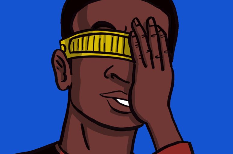
Oh Geordi

In this very special episode, Dave and I look back on season one of Star Trek:The Next Generation and TNGeez for the best and the worst: the things that made us laugh, cry, stand up and cheer! We lived, we loved, we loathed, and we learned.

Note: Dave and I didn’t review our lists with each other, so if we have the same answers, it’s just what the Great Bird intended.

We invite you to play along, and here’s the list of categories. Fill in your answers and email to us at thebridge@tngeez.com Who knows. You may get a little treat in return!

The Best and the Worst of TNG Season One:

  • Best/Worst main character:
  • Best/Worst episode:
  • Best/Worst action moment:
  • Best/Worst secondary character:
  • Best/Worst guest character:
  • Best/Worst Alien Race:
  • Best/Worst Entity:
  • Best/Worst Title:
  • Best/Worst Logic:

The Best and the Worst of TNGeez Season One:

  • Best/Worst Impressions
  • Best/Worst episode of TNGeez
  • Best/Worst episode art
Continue Reading

Meet the Amazing Rob!

Rob!

We hope you’ve enjoyed some of the wild promo videos we’ve been posting for each new episode. They’re a ton of fun, aren’t they? They are. Check out our YouTube channel for  a gaggle of them if you don’t believe me.

Ever wonder how we manage to produce those at the same time we’re doing all our other TNGeez stuff? The answer is our secret weapon, the third TNGeezer, Dave’s little brother, Rob! Let’s take a second and find out more about the Wesley Crusher of TNGeez video.

Rob!

Andrew: Some call you the “Quiet Friend,” the “Silent Partner,” the “Invisible Hand Gently Cradling TNGeez!” Can you step out from behind your virtual curtain and tell us what you do for TNGeez?

Rob: Hopefully what I add to TNGeez is a taste of each podcast episode in a quick and (hopefully) amusing visual presentation. 

Andrew: The videos are really funny and cool, and we’d love a quick behind the scenes on how you dream them up. What’s your process?

Rob: Dave and Andrew deliver such a fun and entertaining interpretation of each STTNG episode it is easy to pull funny outtakes from each podcast.  The boys do a great job of pointing me in the right direction with suggestions on themes as well as beautifully creative artwork.  I also have known both of them for some time and share their same sense of strange humor and love of pop culture.

Andrew: Tell us a little about your love for Star Trek: The Next Generation. Are you the mysterious “brother” Commander Dave keeps referring to as watching the show with him? Are you learning to love TNG because of all this tomfoolery?

Rob: Dave is my older brother, and although I am not as big a fan as he is of ST:TNG, I enjoy it very much.  I guess I really had no choice as I’ve been bombarded with it from him since I was young.

Andrew: We’ve been told you do a wicked Jean Stapleton as Edith Bunker. What are the odds we’ll be hearing it on the podcast soon?

Rob: I will not lie … I can deliver one hell of an Edith Bunker impersonation but am very particular on who hears it.  “SONGS THAT MADE THE HIT PARADE!!!….THOSE WHERE THE DAAAYSSS!!!”.  It takes a lot out of me!

Andrew: Any parting words for the fans?

Rob: Dave and Andrew have such wonderful chemistry in their podcasts, I look forward to working with them on future projects… possibly sooner rather than later as we are in the talks about putting together something to stream on YouTube involving a lot more nostalgic pop culture where more of my audio/visual skills can hopefully add to their creative and hilarious content.

Continue Reading

All About the Episode Art, Part 2: The Continuance of Dave

Part two of our Behind the Scenes Look at making TNGeez art come alive!  Find part one here.

Andrew and I are both big draw-ers and as he stated, we’ve cooperatively been creating art for years. Way back before everything in art went digital, we used to draw indie comics together, or as they used to call them “comix.” Isn’t that a cool way of spelling it? Sometimes Andrew would draw, and I would ink, or the other way around.

I went into illustration and design as a profession, and Andrew could have, but he decided it would be better to have a retirement plan instead.

But back to our ST:TNG process:

VI – The less interesting steps A.K.A.: DIGITAL DESIGN!

After Andrew ships me his art via our cloud solutions, it is my job to make it shine! Andrew has created an excellent illustration, and it’s my job to put my “Designer” hat on. My task is to transform the art into something that works on our blog and social media.

Our website’s template for our episode art is narrower than what I would use in a traditional print format. Sometimes Andrew sends me an image that looks excellent in its original frame but doesn’t fit in our little website rectangle. 

colors

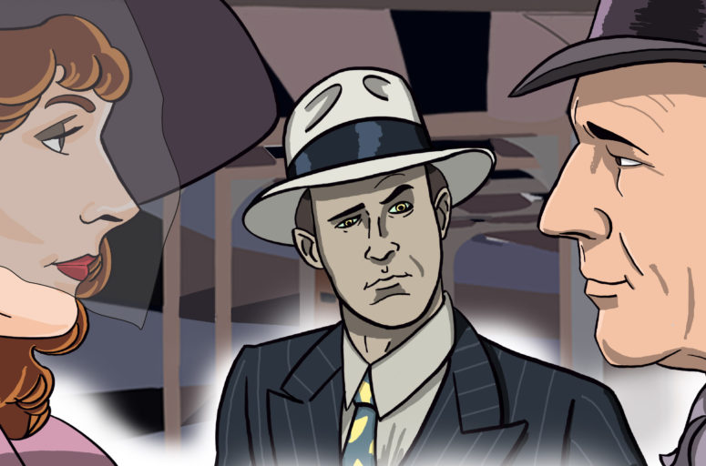
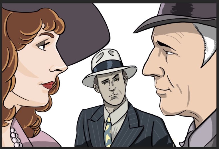
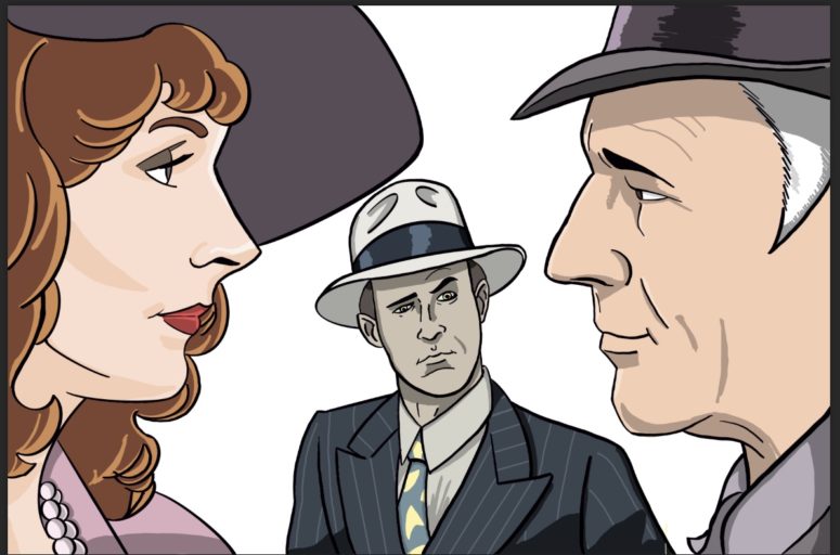
In Andrew’s illustration for “The Big Goodbye,” Bev and Picard were further apart than the template for the art would allow. With Photoshop, I selected their images then moved them closer together, which was something the show was not brave enough to do. The  “The Big Goodbye” might be the episode where Picard and Bev are the closest to hooking up.

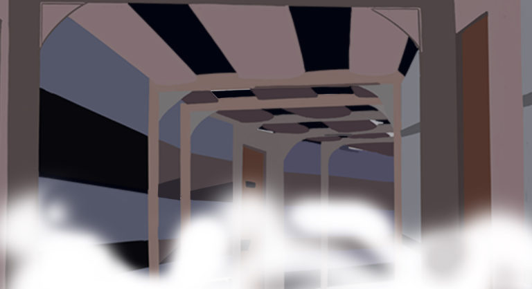
We also needed a background for Bev, Picard, and that intrusive Data, (watch the episode folks). Picard wants to show Beverly his “office” and Data robot-blocks him by offering to join them. Just think what kind of office politics Jean Luc had in mind! We’ll never know because Data had to tag along. I wanted to place the characters not in the scenery of the Holodeck because it would make them less recognizable when seen online. I thought about using the yellow criss cross pattern of the background of the Holodeck, but I’ve never liked the look of it. The Holodeck background is an effect and never looked convincing to me. I went with an Enterprise hallway instead, which deck, I have no idea, but it’s definitely one of the inner decks. As Andrew and I have discussed on the podcast, most of the inhabitants on the Enterprise live and work in window-less rooms and walk through window-less hallways.

With the inner-deck hallway in place, I felt like the art still needed something to give it that film noir look. How about fog! I broke out the airbrush tool in Photoshop and proceeded to make a little San Franciscan fog.

VII- THE VEILING!

I’ve done a lot of digital work, but every once in a while something comes along that is hard to crack, and Bev’s veil is one of those “somethings.” Andrew “handed off” the veil for me to digitally draw. I usually like to use Adobe Illustrator to create shapes and patterns. Adobe Illustrator creates vector art as opposed to pixel art, which is how Photoshop and Procreate work. In Illustrator it is easy to create shapes and repeat those shapes into patterns. I first started by creating a fishnet pattern like the veil Beverly is wearing in the episode. I quickly saw that it was going to be more time consuming than I hoped and the results would be disappointing. I then went back to Photoshop which is Pixel-based instead of Vector-based. We use Vector art in design and fashion when we want to create a very clean image that won’t be affected by reducing or enlarging the image. Pixel-based, or Photoshop is used when we want to create effects like fog, lighting, manipulate photos and complicated illustrations.  (I’ll go into this later, in a different post for anyone who wants to know more details about Pixel vs. Vector).

In Photoshop I painted in a layer of white, where the veil was outlined, then dropped out the opacity, making it see-through. It’s not exactly the veil Bev wore, but you get the idea.

VIII – LABELING, The Final Frontier!

For each piece of episode art, we have to drop in the episode number and title so that the people understand which episode they’re looking at. These two bands of text and color almost always get in the way. I’m often changing positions of the character or reducing art to fit around the bands. Sometimes I’ll drop a character in front of part of the band… talk about minutiae!

Continue Reading

Episode 22 Graphics

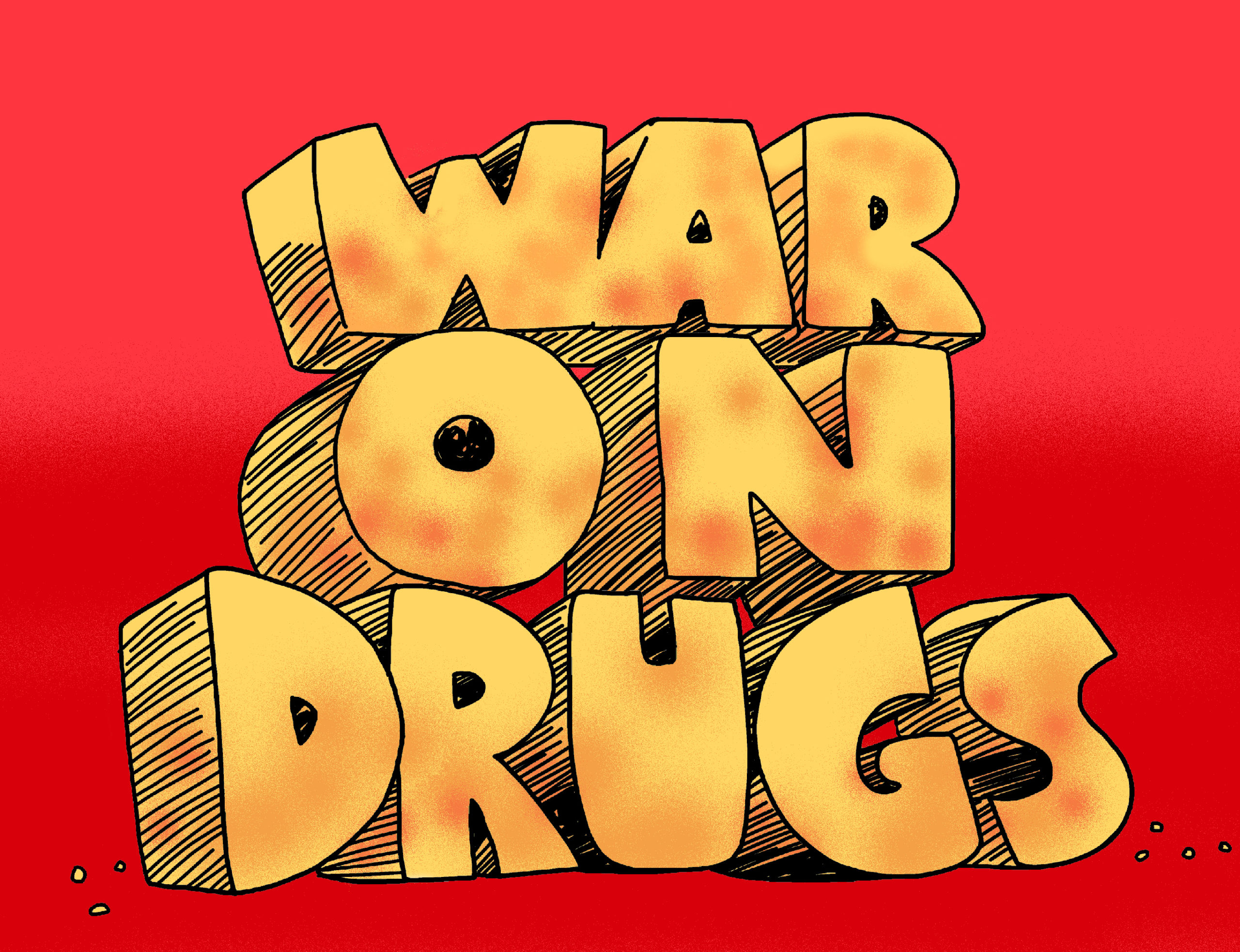
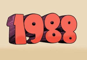
If you didn’t know, we cut a trailer to promote each episode of STTNGeez, Not another Star Trek podcast. For Episode 22 of Season One, we did our take on the “War on Drugs” because that’s what the show did back in 1988. TNG used a heavy hand to dish out some anti-drug rhetoric that lands a bit off target up here in 2021. For the video we wanted to create graphics that conveyed an 80’s vibe and our video master Rob suggested doing a take on the School House Rocks lettering.

We designed two graphics to use in the video. This one’s the “War On Drugs” with a School House sensibility meets Monty Python graphics (watch the way the words land in the teaser), thank you Terry Gilliam!

We also designed a 1988 graphic in the same style but Rob wanted another color scheme. This part is pretty deep dive into the design process, so I hope you’re hanging with me. I remembered one of my favorite book covers that speaks “80’s” to me and used it as the source for the color scheme.

Continue Reading

All about the Episode Art, Part 1: Enter Andrew

colors

When Dave and I started ST:TNGeez, we knew that a big part of what we wanted to do was episode art. We both love drawing and comics, and it was these things that brought us together as friends almost 30 years ago. We think our episode art is one of the more unique aspects of TNGeez. Wanna see how to happens?

Let’s take a look at how we did the art for episode 11, “The Big Goodbye.”

Since the process can be complicated to explain, this post will be broken up into a few parts, with me, Andrew, doing the first bits, and then Commander Davey Dave will manually re-dock the rest.

Usually, Dave and I throw around ideas for the upcoming episode art that wee have laying around in the back of our heads. Once we agree on an idea, one of us volunteers to get started—usually me because Dave is always busy editing upcoming episodes. In this case, we decided we wanted to focus on Bev and Jean-Luc because we love that pairing, but we also wanted to feature Data who is particularly great in this episode.

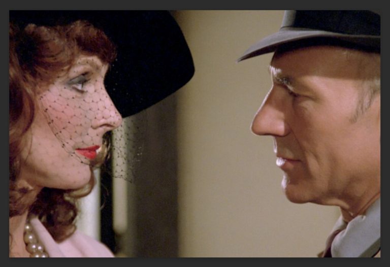
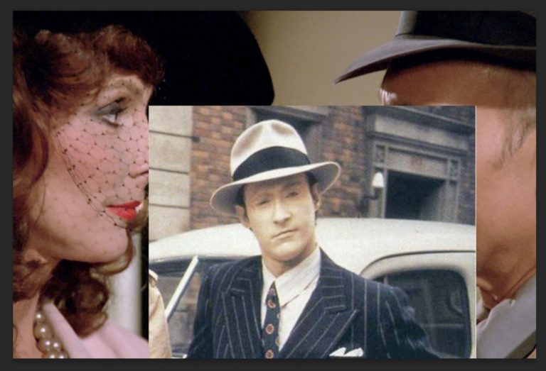
Usually, I start by heading to Trek Core, (trekcore.com), a cool Trek resource site Dave’s brother Rob turned us on to. Trek Core has an excellent collection of screen caps from TNG Blu-Ray DVDs that are high res and pretty comprehensive. I can usually find a source image or three there to reference for the art. I like using reference images to draw on in order to make sure the final image scans easily for listeners and potential listeners alike.

In this case, I chose two images: a fairly common one with Picard and Bev, and another with Data. For the background, I knew I wanted to drag out the same image of the Enterprise hallway Dave and I used for “The Naked Now” too try and save some time and effort. I also brought in an additional Bev image to help with the coloring which I’ll explain later.

Bev and Jonny

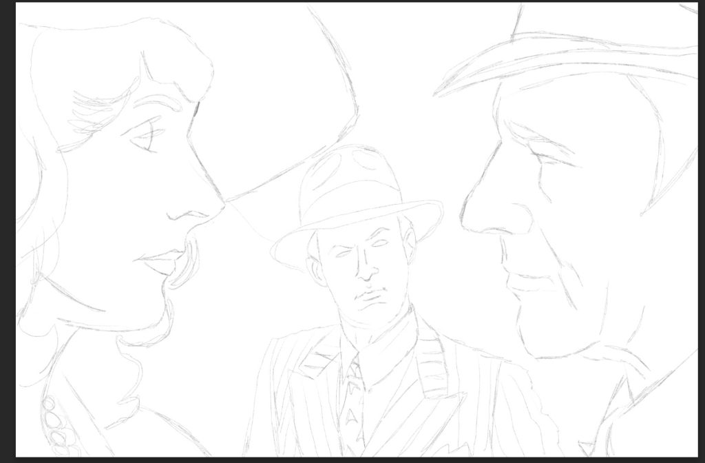
I. Penciling

Tool Time: I rely mostly on the Procreate app running on a 12.9 iPad Pro, and of course, the Apple Pencil. It’s the closest thing to actual drawing I’ve ever experienced with digital tools, and I highly recommend it to pros and newbs alike. Seriously. I’ve used other apps like Photoshop and Clip Studio, and I’ve used Wacom and other tablets, and for me, nothing works as well as Procreate on the Pad with the Pencil.

So once the images are arranged to the layout I want, I do a pencil layer (it’s all about the layers in digital art). This is usually pretty loose, and I intend this layer to help with identify the major lines I’ll be adding during inking, and also help me get a sense of how the central images are going to look. I also want to identify the main areas of focus and isolate them from the background noise or other details of the source image. I’m usually faithful to the source image at this stage.

I used Procreate’s built in technical pencil under the Sketching brushes for this stage.

pencils

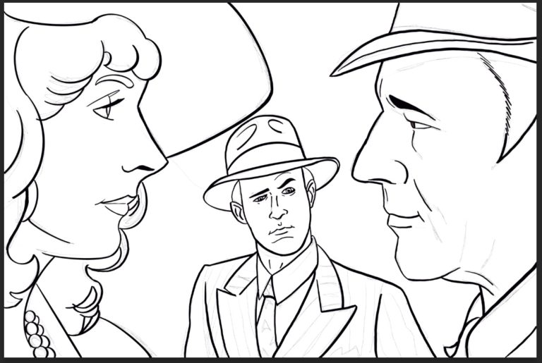
II. Inking

Next comes the part that used to give me severe anxiety when I used to do it the old fashion way—inking. I tried all manner of techniques—brush, pen, brush pen—and I never felt confident about inking. Too many times, I’d a mistake and get so discouraged, I’d walk away. Ya know, this is its own blog post! Coming soon, “Art Anxiety and How to Swing It.”

It’s weird to call it “inking” when no ink is involved, but there it is. The good news is inking digitally is much more forgiving than in the analog world. Fun fact: I still make the most mistakes at this stage. My favorite is when I accidentally forget to switch to the ink layer and ink on the pencil layer. Makes a huge mess, ruins the pencils, and causes me to have to re-ink over the old ink mess in a new layer. (Another upcoming blog: Art Mistakes and How We Make Them”).

Inking takes me a long time because I try to be very careful and keep the lines looking smooth, but not too smooth that they look artificial. I use a Fude brush that I downloaded from somewhere I can’t remember, and I try to vary the line widths and use tampering to mimic a pen. I also use a digital Micron from the same set to do lines I need to look more even and smooth.

inks

Procreate has a smoothing feature to help cut down on the jitters that come from trying to make sweeping lines on such a small surface. One of the bad things about drawing on the iPad is that you have your hand on the canvas, and there’s very little in the way of a flat surface, here the tablet border, to allow you to make grand, sweeping strokes without falling off the edge of the tablet.

I’ve invested in something called SketchboardPro (https://sketchboardpro.com) to help with this, and I’ll review the thing here when it arrives and get to put it to use. The idea is to give your more of a surface to get your hand off the Ipad. It also works as an easel, etc.

Keeping in mind that I’ll need to color this work, too, I try to remember to close my shapes when I can, so I can drag-and-drop colors later.

Speaking of color . . .

III. Coloring

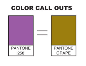
Wanna know another fun fact? I am color blind. Yup, red/green, a.k.a. “deuteranopia,” which is pretty self-explanatory, but lemme tell ya, it’s lent itself to all sorts of amusement for ol’ Davey and so many others. Once union a time, I used to work for Dave a sub-contractor doing color callouts for some projects, and when I had references, I did okay. When I had to color on my own . . . Well, let me just say this, “brown grapes.”

CALL_OUTS

Anywho . . . I begin by creating a color layer and changing the settings to Multiply. I have no idea why this is necessary or what this does, but every tutorial I’ve ever seen on digital coloring says to do it. Here’s what the Procreate Handbook (https://procreate.art/handbook/5.1/layers/layers-blend//):

What does the multiply layer do in procreate?

“This mode multiplies the luminosity of the base color by the blend color. The result is an overall darker and more intense effect. Multiply produces different levels of darkening depending on the luminosity of the blend layer. Multiply is perfect for darkening images or creating shadows.”

Neat!

I also set the inks layer to Reference mode, which the Procreate Handbook explains thusly:

“This advanced feature helps cartoonists and concept artists keep color fills and ink lines separate.With this setting, you can ColorDrop fills onto any Layer. The fills will behave as though they are flowing into the linework (sic) on the Reference Layer.”

Now that actually makes sense to me.

Another cool feature is Procreate’s version of the eye dropper that allows you to choose colors by holding a finger down over a color swatch. This is how I try and find my base colors, by selecting them off of the reference image. Sometimes it works, but sometimes the fine variations  or the mix of pixels used to cheat the eye in a digital image give me bad results. Sometimes I can see that, but other times, it’s up to Uncle Dave to fix it later when I pass the art on to him.

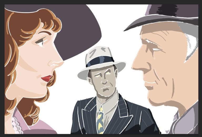
I start with laying down the solid colors, and then I go back for shading and highlights. Now I can’t blend to save my life, so I tend to use color shapes for shading and highlights, and I like the look. To me, it give the art a stronger impact that it needs to stand out online and to work in a limited frame. Here’s what the color layer looks like without the inks . . .


colors alone
colors

IV. Off to Dave!

From there, I export the finished (well, I’m finished 😉 version as a Photoshop file which keeps the layers in tact and all. I won’t bore you with this bit, but just know it involves using cloud storage due to the size of the files. Cloud storage has been a great for us since we can swap these files back and forth with relative ease and with no need to compress them. Back in the day, using apps like StuffIt and ZipIt meant risking file integrity. Also, those slow ass upload/download speeds meant taking a long walk or nap while waiting for the file to do its thing.

Cloud storage has its issues for sure, but it lightyears ahead of the old days.

Next: Episode Art, Part 2, Dave Takes Over!

Continue Reading

Birth of a Banner!

TNGeez: Behind the Scenes!<br

Welcome to our first little BTS feature where we give you, the fans, a glimpse at the inner workings of the machine called ST:TNGeez! This is for those of you who enjoy weird, arcane, process stuff like we do.

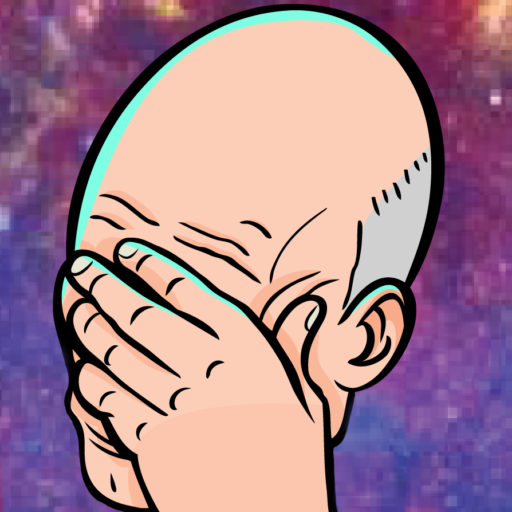
So a big part of the podcast is the art we produce for every episode and for the show in general, and we will definitely give you a more thorough look at how we produce episode art in these posts, but for now, we want to look at our “facepalm Picard” banner came to be.

When we first dreamt up doing this show, we knew we needed an image that would give a sense of the tone we were after. While the name came pretty quickly, we needed a good image to back it up, and the famous “facepalm Picard” was the obvious choice.

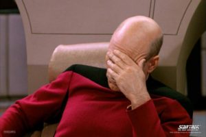
For those of you unfamiliar with the origin of the meme, here’s some background from knowyourmeme.com:

“One of the most popular facepalm images is one of Captain Jean-Luc Picard from Star Trek the Next Generation taken from the episode ‘Deja Q,’ which aired on February 5th, 1990. The earliest known reference to Picard’s action as a ‘facepalm’ was uploaded to YouTube by YouTuber Johan Jacobsen on May 21st, 2007. “

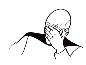
While we were playing with the site design (yes, we actually tried to design it), Andrew did a take on “facepalm Picard” and sent it to Dave who made it look finished and professional. Below, you can see some of the drafts we went through, including the original drawing.

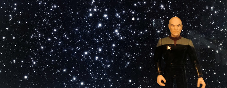
But Total Truth Time means that we did create a place holder you might want to see. It’s basically a Playmates Picard standing in front of a computer screen with a star field behind him. Seriously. We put an action figure in front of an iMac and took a photo on a cell phone. That’s just how we roll.

In future posts, we’ll dive into the birth of the Dream on It name, the TNGeez logo, and that crazy episode art. If there’s anything else you’d like to know or read about, drop us a line at thebridge@tngeez.com and we’ll try to get it done for you.

Original "facepalm Picard" image Andrew used.

Original “facepalm Picard” image Andrew used.

Andrew's sketch.

Andrew’s sketch.

Dave's early draft

Dave’s early draft

Action figure in front of a monitor.

Playmates Picard action figure in front of an iMac. Seriously. We thought this was a good idea. 

Continue Reading