Part two of our Behind the Scenes Look at making TNGeez art come alive! Find part one here.
Andrew and I are both big draw-ers and as he stated, we’ve cooperatively been creating art for years. Way back before everything in art went digital, we used to draw indie comics together, or as they used to call them “comix.” Isn’t that a cool way of spelling it? Sometimes Andrew would draw, and I would ink, or the other way around.

I went into illustration and design as a profession, and Andrew could have, but he decided it would be better to have a retirement plan instead.
But back to our ST:TNG process:
VI – The less interesting steps A.K.A.: DIGITAL DESIGN!
After Andrew ships me his art via our cloud solutions, it is my job to make it shine! Andrew has created an excellent illustration, and it’s my job to put my “Designer” hat on. My task is to transform the art into something that works on our blog and social media.
Our website’s template for our episode art is narrower than what I would use in a traditional print format. Sometimes Andrew sends me an image that looks excellent in its original frame but doesn’t fit in our little website rectangle.

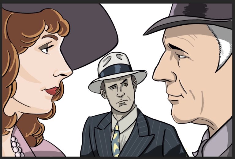
In Andrew’s illustration for “The Big Goodbye,” Bev and Picard were further apart than the template for the art would allow. With Photoshop, I selected their images then moved them closer together, which was something the show was not brave enough to do. The “The Big Goodbye” might be the episode where Picard and Bev are the closest to hooking up.
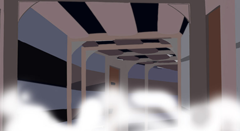
We also needed a background for Bev, Picard, and that intrusive Data, (watch the episode folks). Picard wants to show Beverly his “office” and Data robot-blocks him by offering to join them. Just think what kind of office politics Jean Luc had in mind! We’ll never know because Data had to tag along. I wanted to place the characters not in the scenery of the Holodeck because it would make them less recognizable when seen online. I thought about using the yellow criss cross pattern of the background of the Holodeck, but I’ve never liked the look of it. The Holodeck background is an effect and never looked convincing to me. I went with an Enterprise hallway instead, which deck, I have no idea, but it’s definitely one of the inner decks. As Andrew and I have discussed on the podcast, most of the inhabitants on the Enterprise live and work in window-less rooms and walk through window-less hallways.
With the inner-deck hallway in place, I felt like the art still needed something to give it that film noir look. How about fog! I broke out the airbrush tool in Photoshop and proceeded to make a little San Franciscan fog.

VII- THE VEILING!
I’ve done a lot of digital work, but every once in a while something comes along that is hard to crack, and Bev’s veil is one of those “somethings.” Andrew “handed off” the veil for me to digitally draw. I usually like to use Adobe Illustrator to create shapes and patterns. Adobe Illustrator creates vector art as opposed to pixel art, which is how Photoshop and Procreate work. In Illustrator it is easy to create shapes and repeat those shapes into patterns. I first started by creating a fishnet pattern like the veil Beverly is wearing in the episode. I quickly saw that it was going to be more time consuming than I hoped and the results would be disappointing. I then went back to Photoshop which is Pixel-based instead of Vector-based. We use Vector art in design and fashion when we want to create a very clean image that won’t be affected by reducing or enlarging the image. Pixel-based, or Photoshop is used when we want to create effects like fog, lighting, manipulate photos and complicated illustrations. (I’ll go into this later, in a different post for anyone who wants to know more details about Pixel vs. Vector).
In Photoshop I painted in a layer of white, where the veil was outlined, then dropped out the opacity, making it see-through. It’s not exactly the veil Bev wore, but you get the idea.

VIII – LABELING, The Final Frontier!
For each piece of episode art, we have to drop in the episode number and title so that the people understand which episode they’re looking at. These two bands of text and color almost always get in the way. I’m often changing positions of the character or reducing art to fit around the bands. Sometimes I’ll drop a character in front of part of the band… talk about minutiae!
