When Dave and I started ST:TNGeez, we knew that a big part of what we wanted to do was episode art. We both love drawing and comics, and it was these things that brought us together as friends almost 30 years ago. We think our episode art is one of the more unique aspects of TNGeez. Wanna see how to happens?
Let’s take a look at how we did the art for episode 11, “The Big Goodbye.”
Since the process can be complicated to explain, this post will be broken up into a few parts, with me, Andrew, doing the first bits, and then Commander Davey Dave will manually re-dock the rest.
Usually, Dave and I throw around ideas for the upcoming episode art that wee have laying around in the back of our heads. Once we agree on an idea, one of us volunteers to get started—usually me because Dave is always busy editing upcoming episodes. In this case, we decided we wanted to focus on Bev and Jean-Luc because we love that pairing, but we also wanted to feature Data who is particularly great in this episode.
Usually, I start by heading to Trek Core, (trekcore.com), a cool Trek resource site Dave’s brother Rob turned us on to. Trek Core has an excellent collection of screen caps from TNG Blu-Ray DVDs that are high res and pretty comprehensive. I can usually find a source image or three there to reference for the art. I like using reference images to draw on in order to make sure the final image scans easily for listeners and potential listeners alike.
In this case, I chose two images: a fairly common one with Picard and Bev, and another with Data. For the background, I knew I wanted to drag out the same image of the Enterprise hallway Dave and I used for “The Naked Now” too try and save some time and effort. I also brought in an additional Bev image to help with the coloring which I’ll explain later.
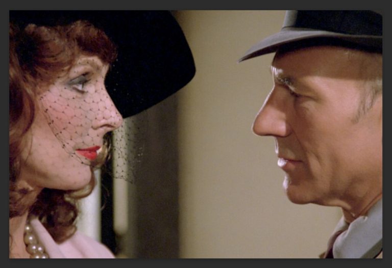
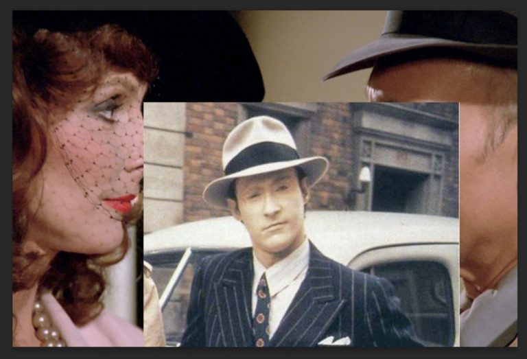
I. Penciling
Tool Time: I rely mostly on the Procreate app running on a 12.9 iPad Pro, and of course, the Apple Pencil. It’s the closest thing to actual drawing I’ve ever experienced with digital tools, and I highly recommend it to pros and newbs alike. Seriously. I’ve used other apps like Photoshop and Clip Studio, and I’ve used Wacom and other tablets, and for me, nothing works as well as Procreate on the Pad with the Pencil.
So once the images are arranged to the layout I want, I do a pencil layer (it’s all about the layers in digital art). This is usually pretty loose, and I intend this layer to help with identify the major lines I’ll be adding during inking, and also help me get a sense of how the central images are going to look. I also want to identify the main areas of focus and isolate them from the background noise or other details of the source image. I’m usually faithful to the source image at this stage.
I used Procreate’s built in technical pencil under the Sketching brushes for this stage.
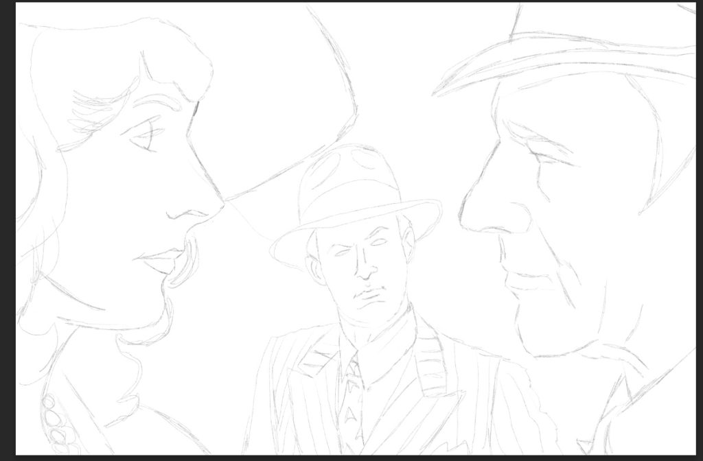
II. Inking
Next comes the part that used to give me severe anxiety when I used to do it the old fashion way—inking. I tried all manner of techniques—brush, pen, brush pen—and I never felt confident about inking. Too many times, I’d a mistake and get so discouraged, I’d walk away. Ya know, this is its own blog post! Coming soon, “Art Anxiety and How to Swing It.”
It’s weird to call it “inking” when no ink is involved, but there it is. The good news is inking digitally is much more forgiving than in the analog world. Fun fact: I still make the most mistakes at this stage. My favorite is when I accidentally forget to switch to the ink layer and ink on the pencil layer. Makes a huge mess, ruins the pencils, and causes me to have to re-ink over the old ink mess in a new layer. (Another upcoming blog: Art Mistakes and How We Make Them”).
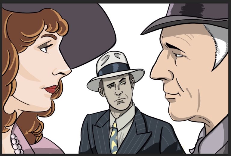
Inking takes me a long time because I try to be very careful and keep the lines looking smooth, but not too smooth that they look artificial. I use a Fude brush that I downloaded from somewhere I can’t remember, and I try to vary the line widths and use tampering to mimic a pen. I also use a digital Micron from the same set to do lines I need to look more even and smooth.
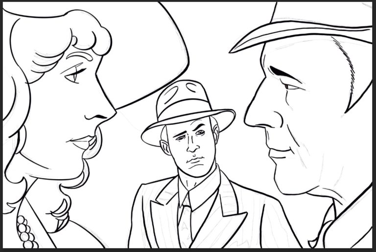
Procreate has a smoothing feature to help cut down on the jitters that come from trying to make sweeping lines on such a small surface. One of the bad things about drawing on the iPad is that you have your hand on the canvas, and there’s very little in the way of a flat surface, here the tablet border, to allow you to make grand, sweeping strokes without falling off the edge of the tablet.
I’ve invested in something called SketchboardPro (https://sketchboardpro.com) to help with this, and I’ll review the thing here when it arrives and get to put it to use. The idea is to give your more of a surface to get your hand off the Ipad. It also works as an easel, etc.
Keeping in mind that I’ll need to color this work, too, I try to remember to close my shapes when I can, so I can drag-and-drop colors later.
Speaking of color . . .
III. Coloring
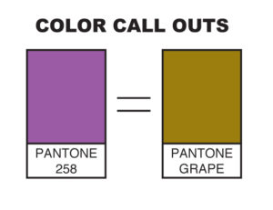
Wanna know another fun fact? I am color blind. Yup, red/green, a.k.a. “deuteranopia,” which is pretty self-explanatory, but lemme tell ya, it’s lent itself to all sorts of amusement for ol’ Davey and so many others. Once union a time, I used to work for Dave a sub-contractor doing color callouts for some projects, and when I had references, I did okay. When I had to color on my own . . . Well, let me just say this, “brown grapes.”
Anywho . . . I begin by creating a color layer and changing the settings to Multiply. I have no idea why this is necessary or what this does, but every tutorial I’ve ever seen on digital coloring says to do it. Here’s what the Procreate Handbook (https://procreate.art/handbook/5.1/layers/layers-blend//):
What does the multiply layer do in procreate?
“This mode multiplies the luminosity of the base color by the blend color. The result is an overall darker and more intense effect. Multiply produces different levels of darkening depending on the luminosity of the blend layer. Multiply is perfect for darkening images or creating shadows.”
Neat!
I also set the inks layer to Reference mode, which the Procreate Handbook explains thusly:
“This advanced feature helps cartoonists and concept artists keep color fills and ink lines separate.With this setting, you can ColorDrop fills onto any Layer. The fills will behave as though they are flowing into the linework (sic) on the Reference Layer.”
Now that actually makes sense to me.
Another cool feature is Procreate’s version of the eye dropper that allows you to choose colors by holding a finger down over a color swatch. This is how I try and find my base colors, by selecting them off of the reference image. Sometimes it works, but sometimes the fine variations or the mix of pixels used to cheat the eye in a digital image give me bad results. Sometimes I can see that, but other times, it’s up to Uncle Dave to fix it later when I pass the art on to him.
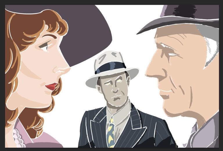
I start with laying down the solid colors, and then I go back for shading and highlights. Now I can’t blend to save my life, so I tend to use color shapes for shading and highlights, and I like the look. To me, it give the art a stronger impact that it needs to stand out online and to work in a limited frame. Here’s what the color layer looks like without the inks . . .
IV. Off to Dave!
From there, I export the finished (well, I’m finished 😉 version as a Photoshop file which keeps the layers in tact and all. I won’t bore you with this bit, but just know it involves using cloud storage due to the size of the files. Cloud storage has been a great for us since we can swap these files back and forth with relative ease and with no need to compress them. Back in the day, using apps like StuffIt and ZipIt meant risking file integrity. Also, those slow ass upload/download speeds meant taking a long walk or nap while waiting for the file to do its thing.
Cloud storage has its issues for sure, but it lightyears ahead of the old days.
Next: Episode Art, Part 2, Dave Takes Over!
